
Design System
Creating a shared design and engineering foundation that made it faster to design, prototype and ship consistent product experiences across web and mobile.
Library, Atomic, MCP-Driven • 2026
Creating a shared design and engineering foundation that made it faster to design, prototype and ship consistent product experiences across web and mobile.
Library, Atomic, MCP-Driven • 2026
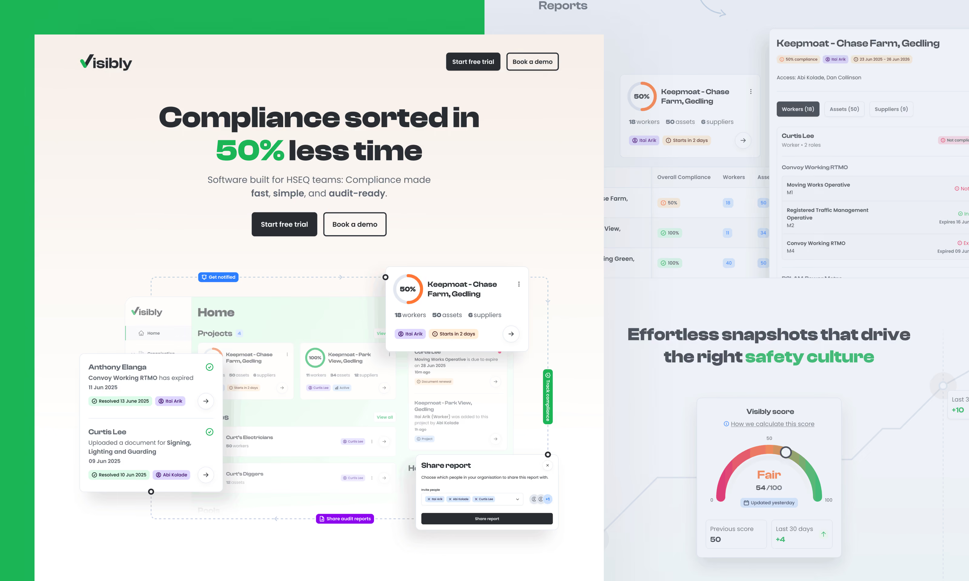
As Visibly continued to scale, so did the complexity of the product and the expectations of its customers. Moving quickly was becoming increasingly important, but speed couldn't come at the expense of consistency or quality.
We needed a shared system that brought design and engineering closer together; establishing a common visual language and clearer rules for how the product should evolve.
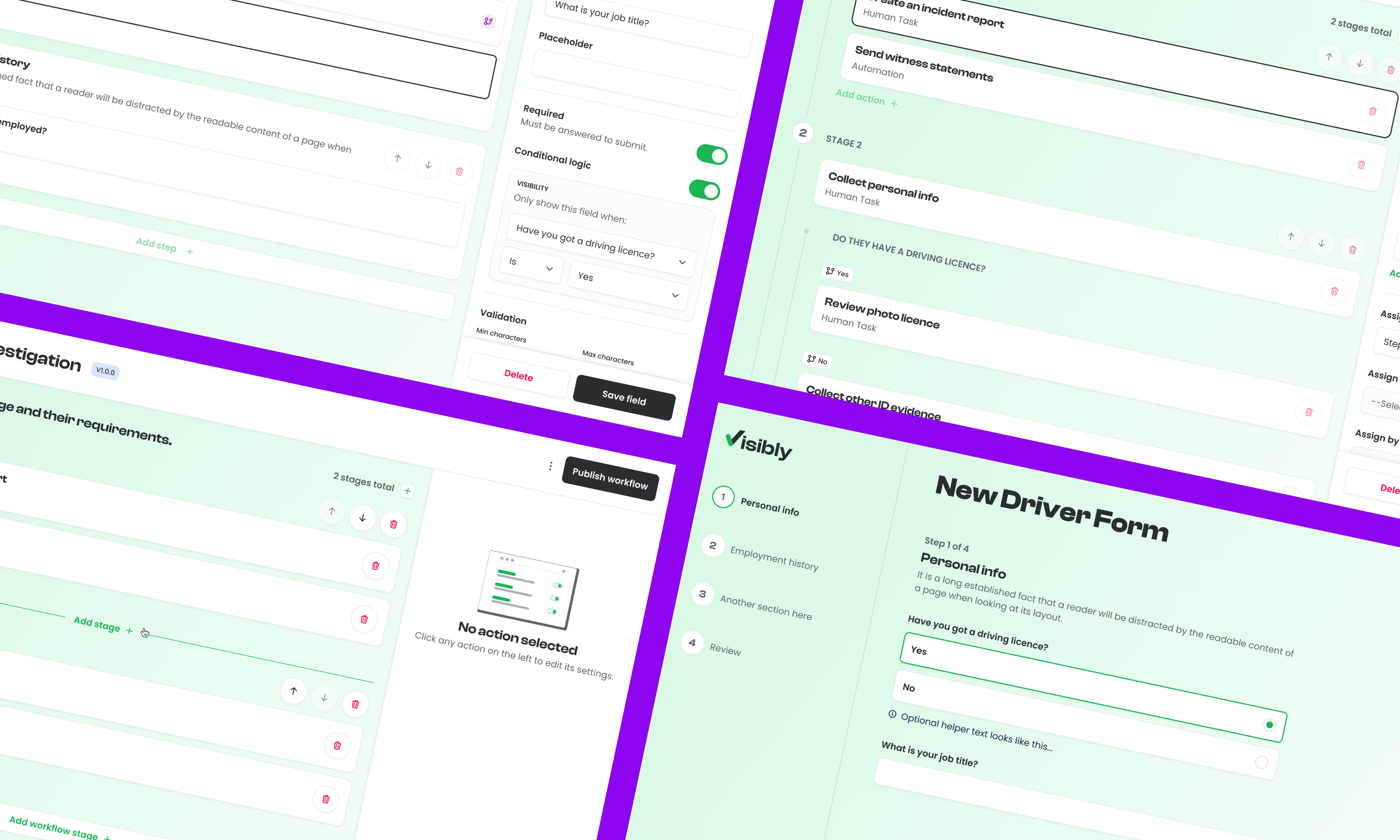
The goal was to create more than a component library. It needed to become a reliable source of truth that could improve delivery across design, development and rapid prototyping.
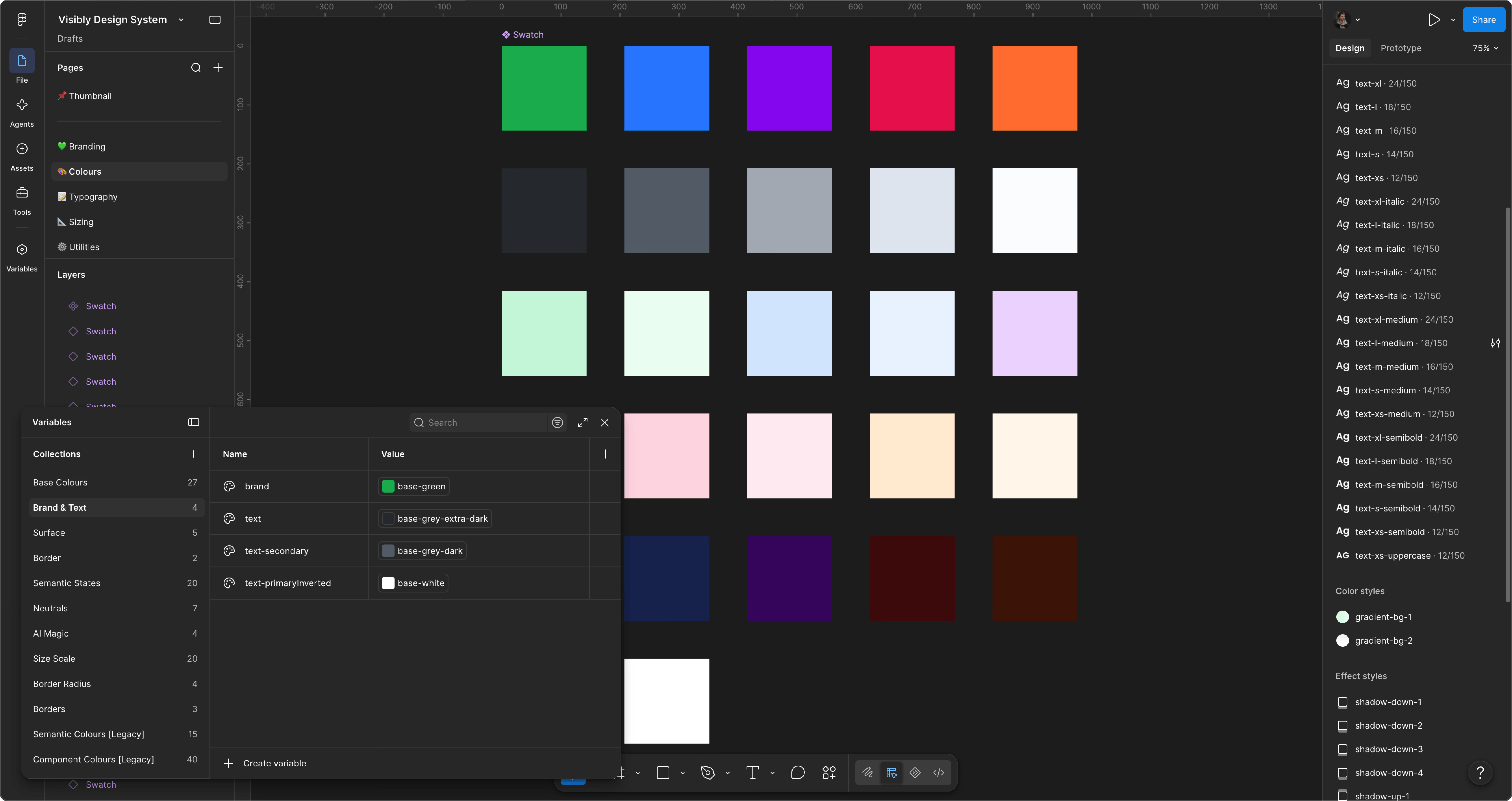
I began by auditing the existing product to understand the styles, variables, components and interaction patterns already in use.
This gave me a clearer picture of where inconsistencies had developed, what could be consolidated, and which foundations needed to be established.
The work was developed in parallel with the lead engineer, reviewing the existing codebase and aligning the design system with the team's Storybook implementation.
This meant decisions weren't being made independently in Figma and translated later. Design and engineering could establish a shared component architecture, naming structure and token model from the outset.
The system was then structured around reusable foundations and atomic principles, allowing smaller decisions; such as colour, spacing, typography and states to flow consistently into increasingly complex components and product experiences.
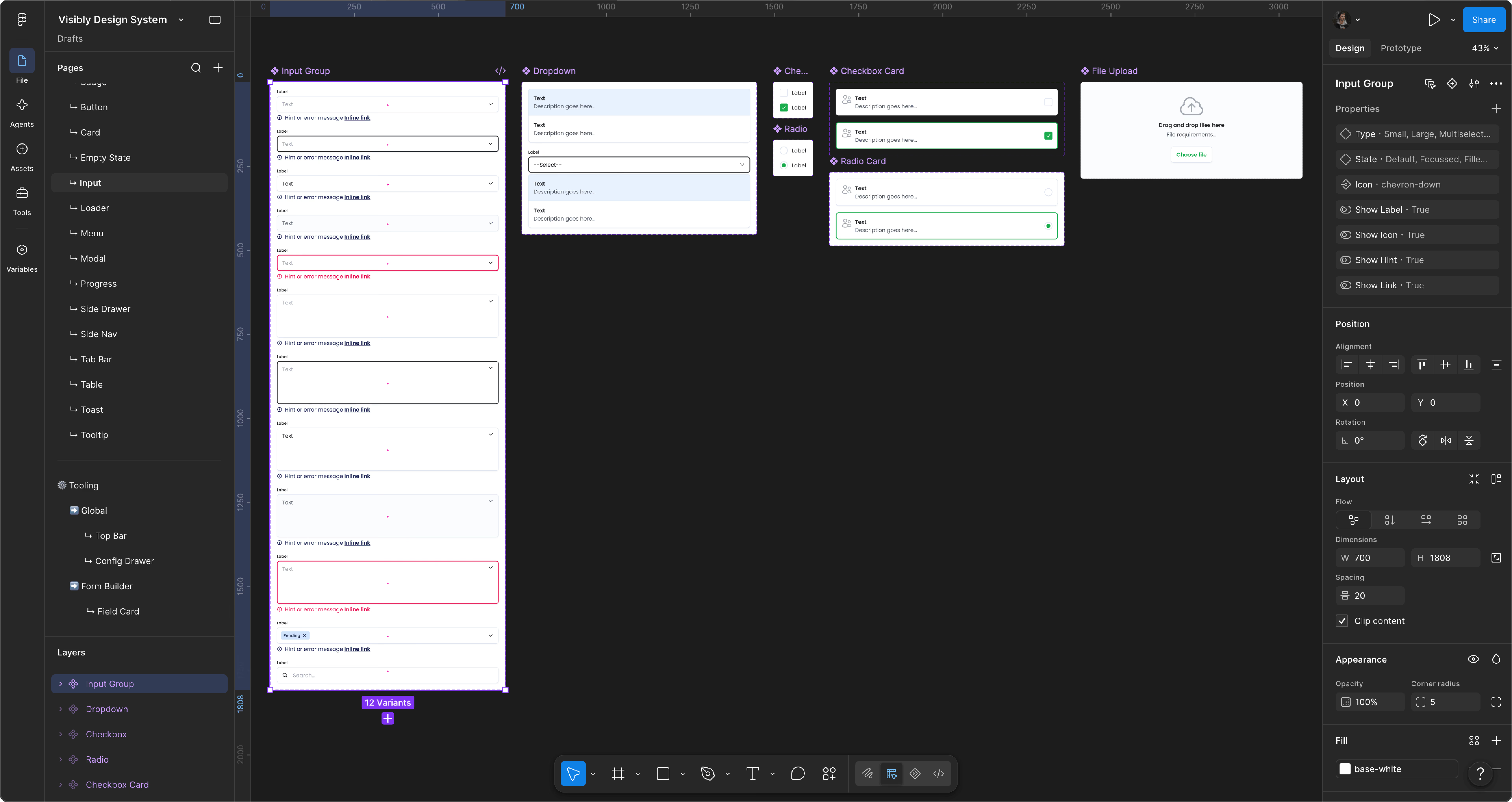
A new token-based library established shared variables for colour, typography, spacing, states and other foundational properties.
These foundations could then be mapped into Storybook, creating a common source of truth between design and engineering and reducing the opportunity for the two implementations to drift apart.
Styles, variables and components were structured so that the same foundations could support both web and mobile experiences.
Rather than creating isolated libraries for individual parts of the product, the system provided a consistent core that could be extended where platform-specific requirements emerged.
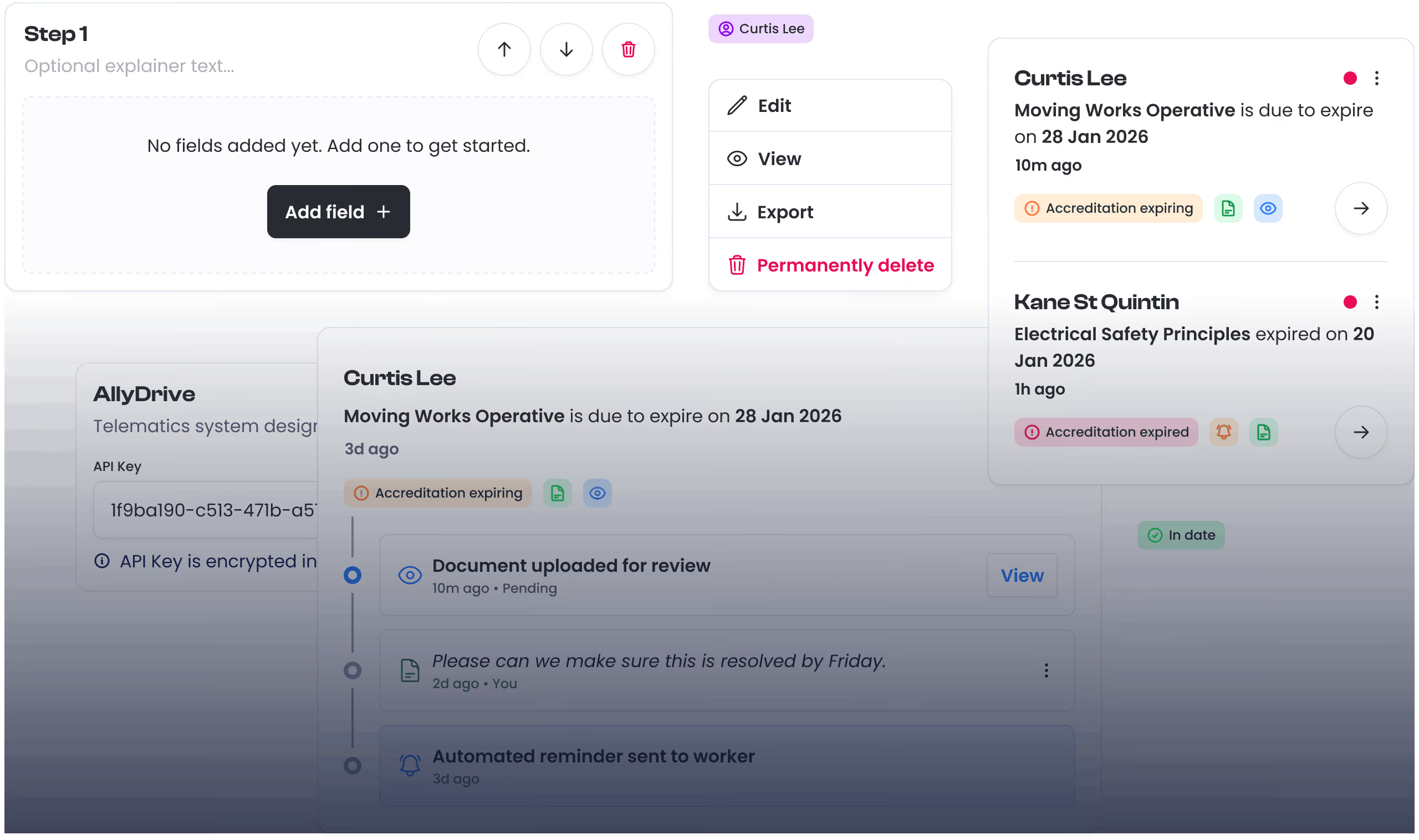
More complex product areas required their own component groups and patterns.
These could be categorised around specific use cases while still inheriting the correct tokens and foundations from the wider system; giving teams flexibility without introducing unnecessary visual or behavioural inconsistency.
The design system also became the foundation for an MCP workflow that connected our established product language with AI-assisted prototyping and engineering.
By giving agents greater context around the available components, tokens and patterns, prototypes could be created significantly faster while remaining closer to the real product.
This also allowed agents to make better-informed assumptions when requirements were incomplete, rather than inventing entirely new patterns or visual treatments.
The result was a much tighter loop between idea, prototype, design and production.
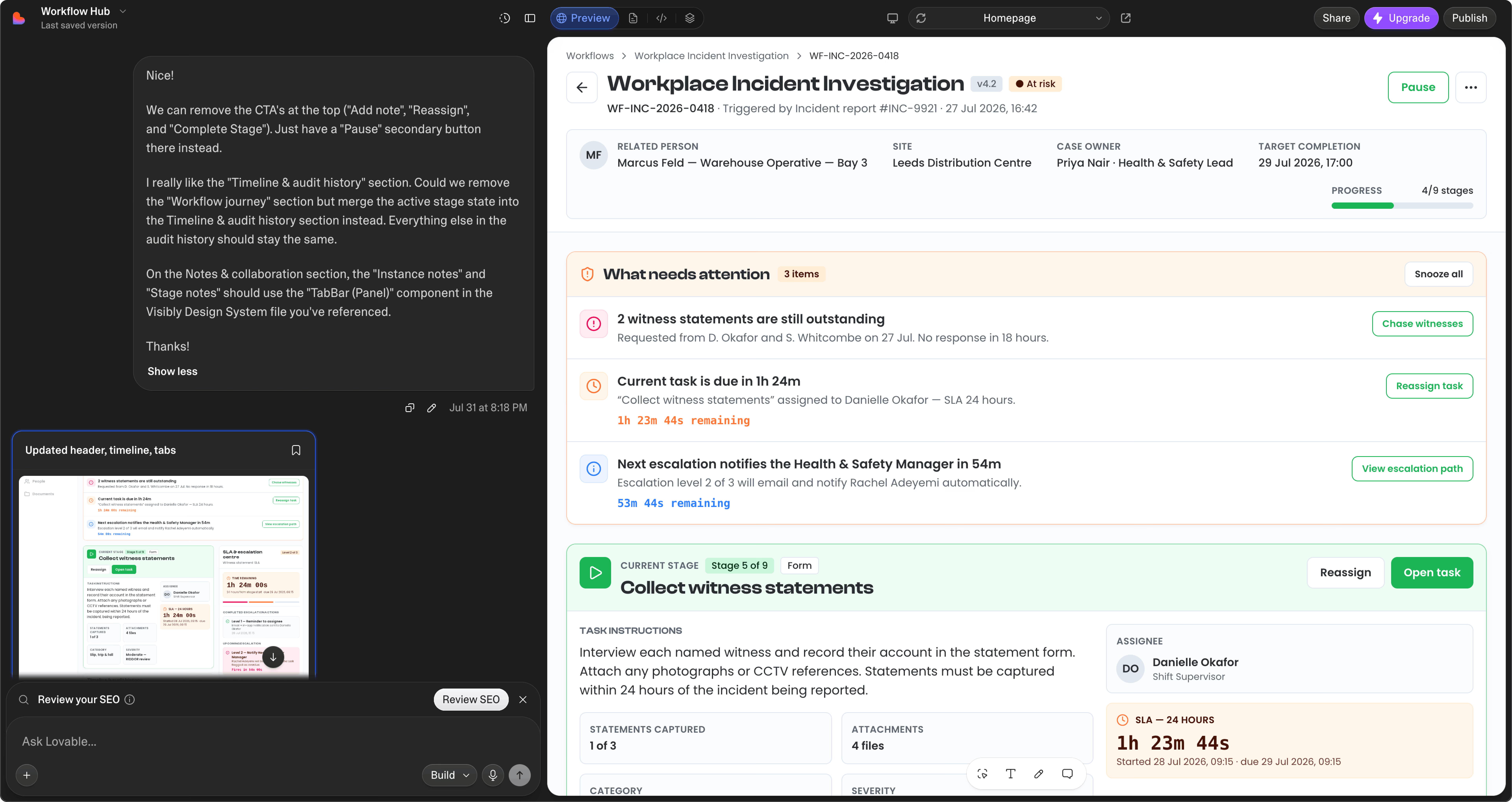
Yes, I thank the agents... So that I know I’m safe when they take over ;)
The new system made it faster to design, develop and ship new product experiences without sacrificing consistency or quality.
Designers and engineers could work from the same foundations, reducing duplicated decisions and making handoff considerably more predictable.
It also gave other members of the team greater autonomy to explore ideas and create early prototypes using established product patterns rather than starting from scratch.
Alongside the system itself, clear documentation made it easier for new team members and third-party collaborators to understand how the product was structured and how components should be used.
Most importantly, the combination of a mature design system, Storybook integration and MCP-assisted workflows created an infrastructure that could continue scaling with the product -- making rapid experimentation easier without allowing the experience to fragment.