Design System
Led the creation of the Zen Educate Design System and component library, giving designers and engineers a unified source of truth. Consistency, fewer headaches, faster shipping.
Library, Tokens, Atomic • 2024
Led the creation of the Zen Educate Design System and component library, giving designers and engineers a unified source of truth. Consistency, fewer headaches, faster shipping.
Library, Tokens, Atomic • 2024
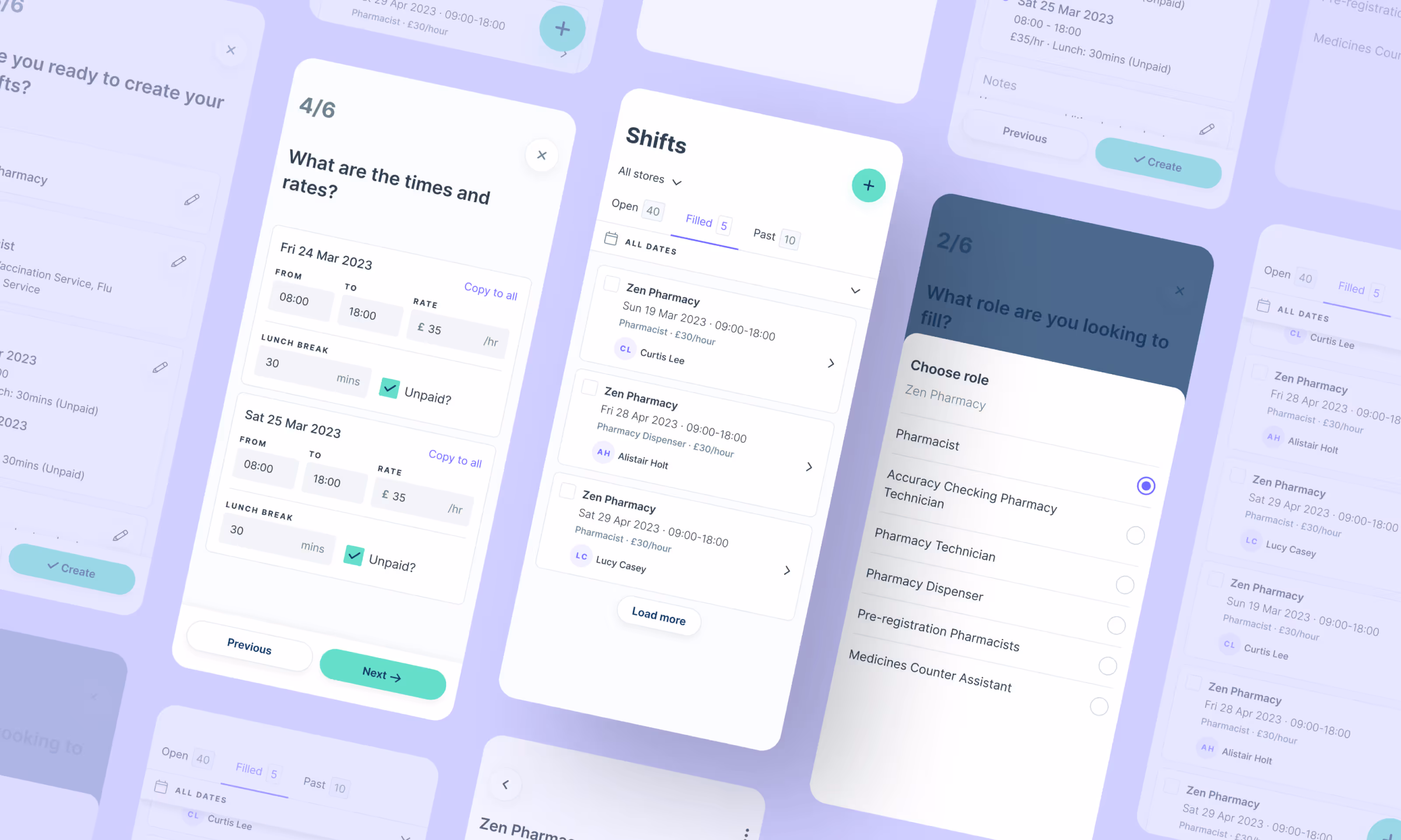
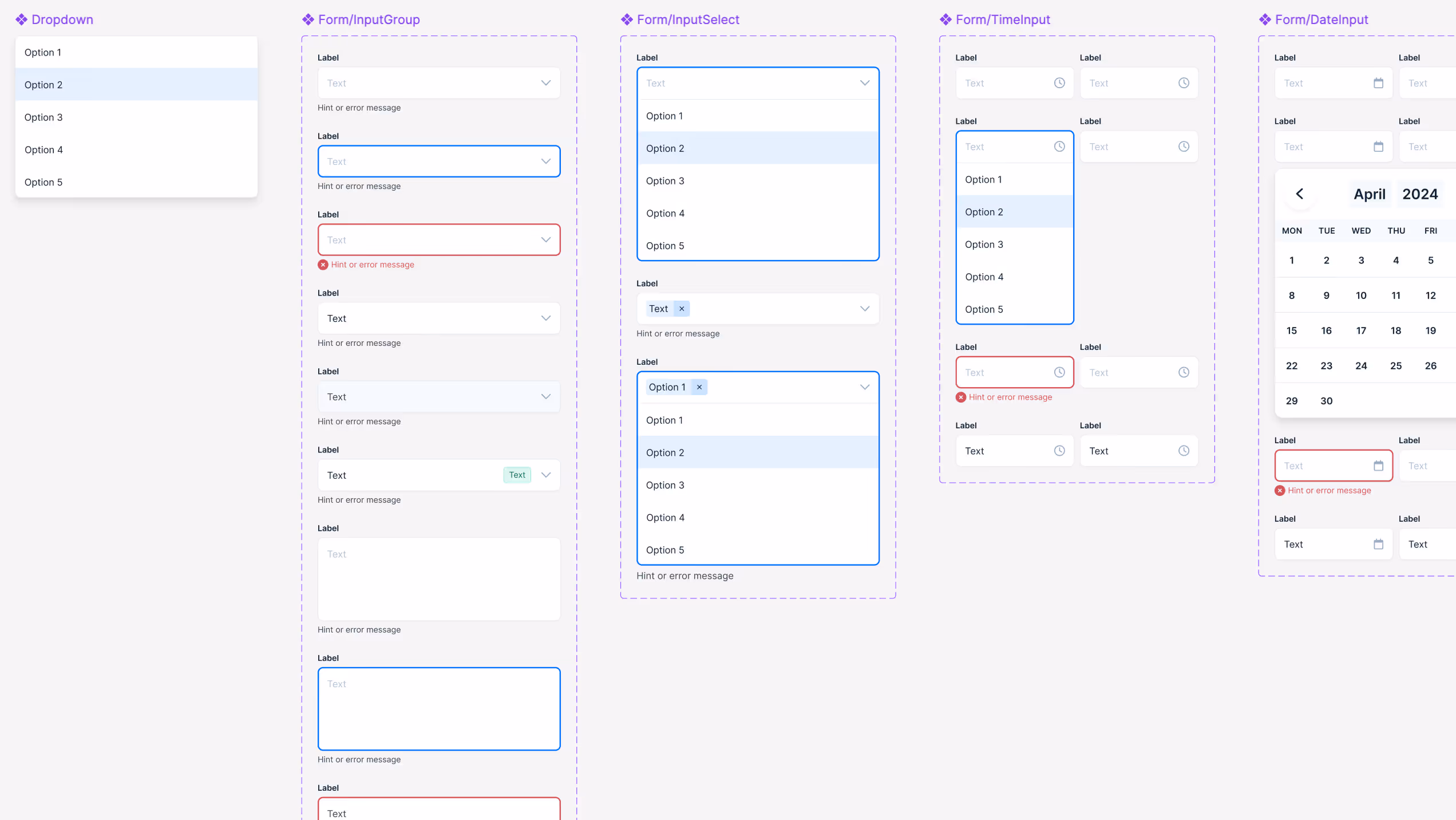
As Zen continued to scale, we started to hit bottlenecks; duplicating solutions, misaligned styles and patterns, and a general lack of clarity on what already existed in our arsenal.
There had to be a better way. I took on the challenge of building a shared design system that would act as a single source of truth for the entire team. No matter what part of the product you were working on, this system would serve as our north star for consistency and speed.
To kick things off, I dug deep into every corner of the product; cataloguing potential components (and their variants), as well as text styles, colour palettes, and all the little extras like utility classes for shadows, borders, and spacing etc.
With a solid list of requirements in hand, it was time to fire up Figma and get to work.
This was a highly collaborative process. I didn’t just want to tick off a checklist for a V1 release; I wanted to stress-test the system with the rest of the design team. By watching how they interacted with the library and tweaking things in real-time, we were able to catch pain points early and ensure the full launch was smooth, with minimal teething issues.
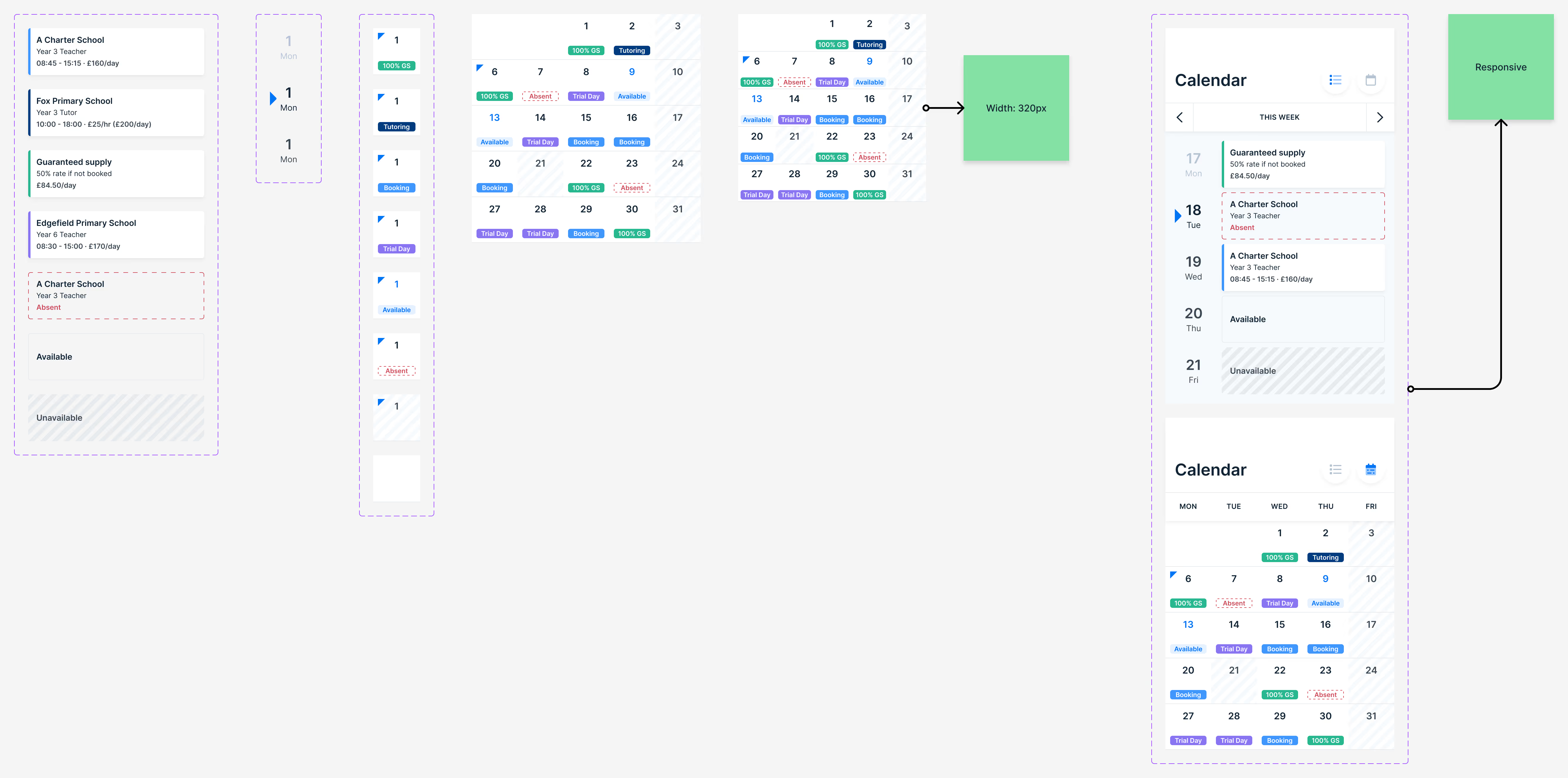
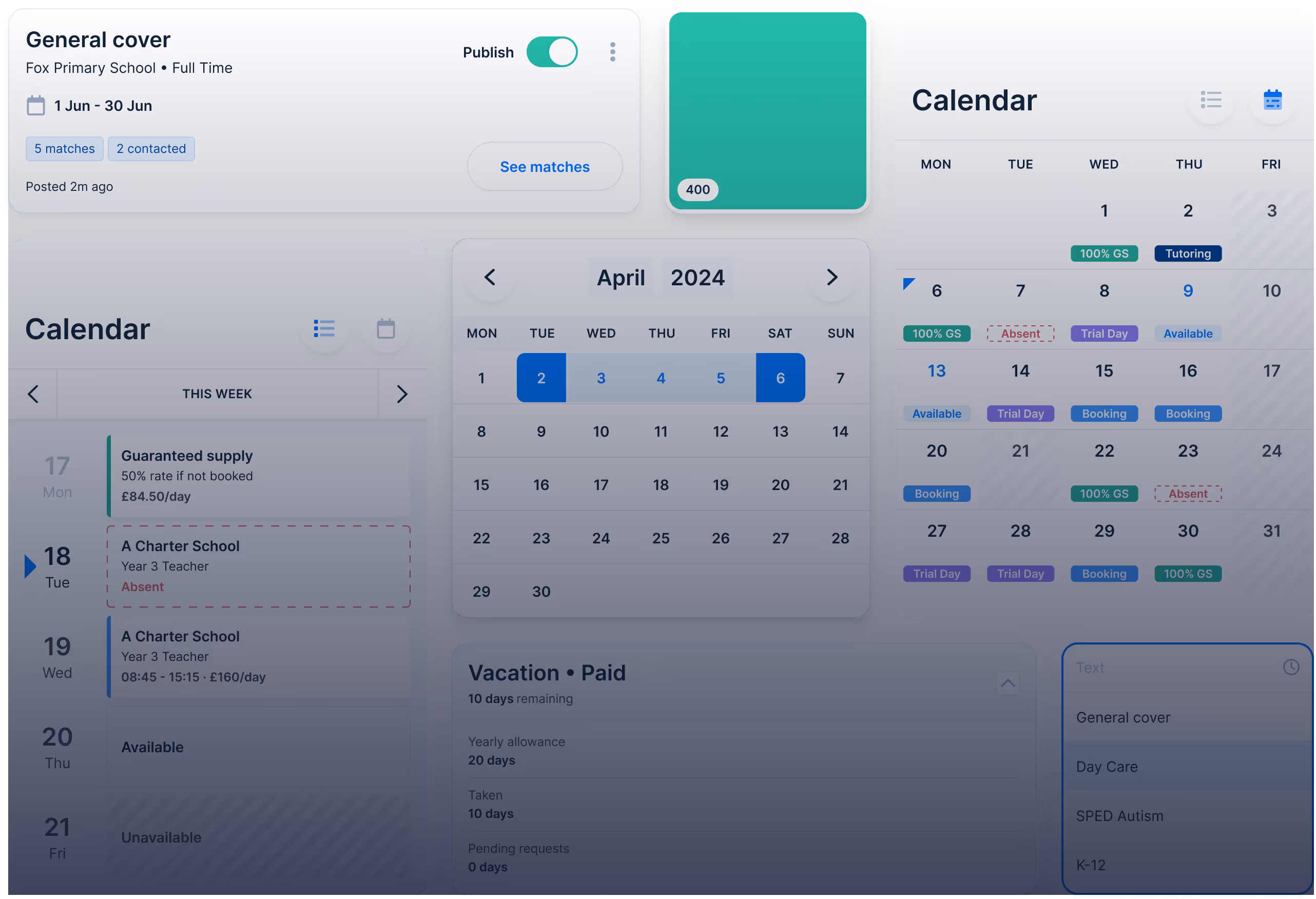
A robust Design System that sped up both design & development across teams.
A unified native app and web-view design experience. One brand. One visual language.
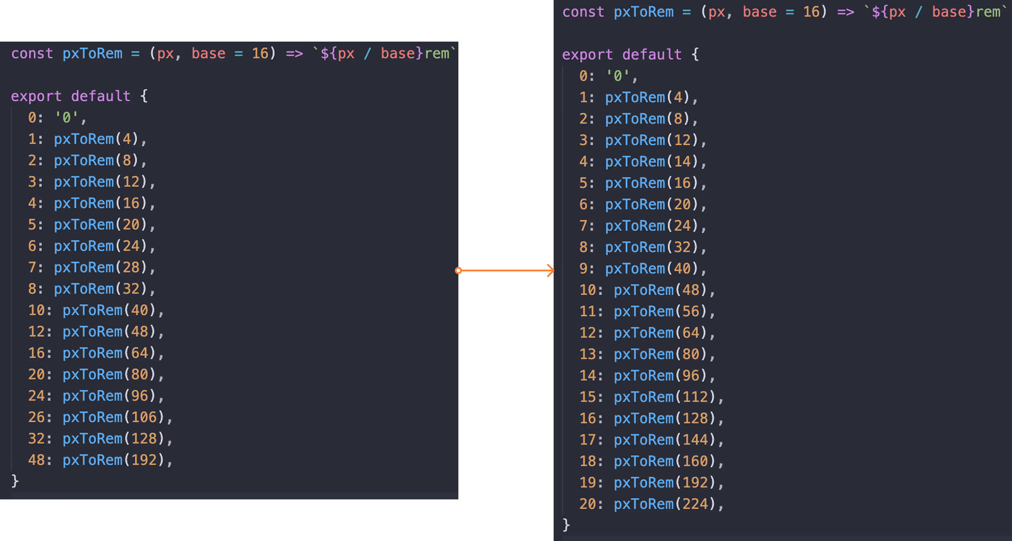
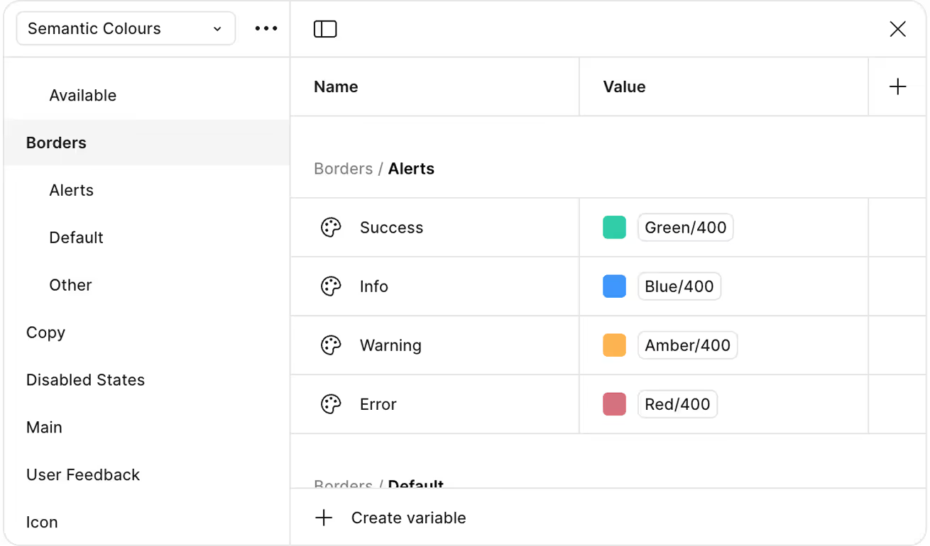
30+ component groups (not counting the variants), a streamlined colour palette with base hues ranging from 100-900 (Tailwind style 😎), plus semantic tokens. We also baked in text styles, spacing scales, utility classes, helpers & annotations… you name it!
A happy design team. And a very happy Curt.
I wrapped things up with a talk to the wider product team, unveiling the new Design System and highlighting the value it would bring as we moved into a new phase of growth.
Not only did the team embrace the system, but I also began collaborating with the engineers in updating our codebase and seeing how we could use Storybook to our advantage.
Overall, it was a challenging but incredibly rewarding project… and one that’s far from finished. As the team continues to use the system and build out new components, they've also taken ownership in evolving and updating it as needed.
The system also proved invaluable when onboarding our newest designer. They were able to dive straight into high-impact work, already equipped with the blueprint and visual language to hit the ground running.
10/10 would do it again.
